LOGO
Symbol
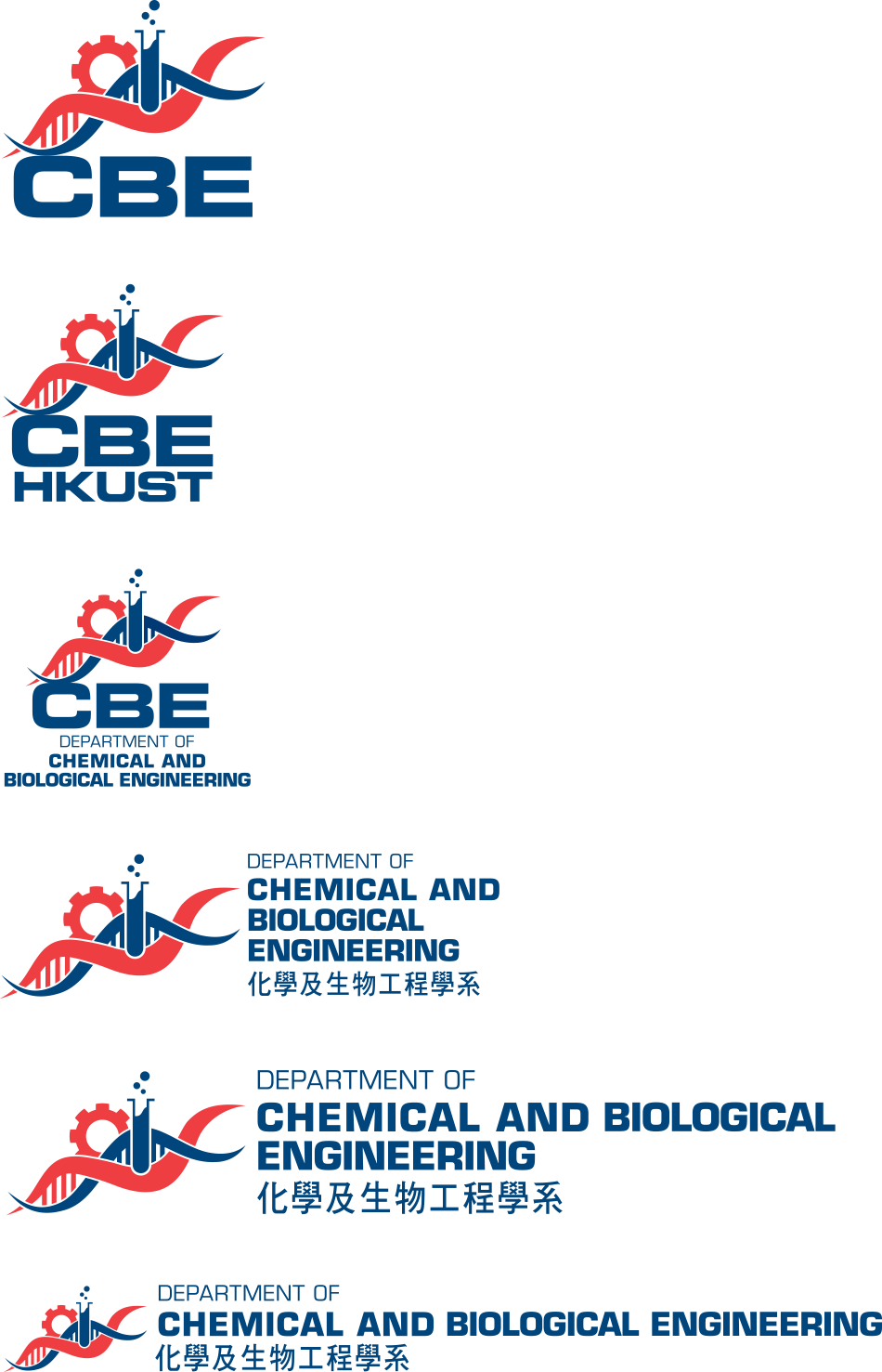
Our new CBE logo reflects innovation and the interdisciplinary spirit of our newly integrated department, and reveals our collective commitment to achieve excellence at one of the best universities in the vibrant world city of Hong Kong.
The two waves represent the integration and interconnectedness of Chemistry and Biology; the stripes between them forming the shape of the double helix structure of DNA depict Biology while the filled test tube represents Chemistry. The intertwining of the waves shows the complementary nature of these two disciplines and illustrate their inseparability.
Moreover, the red wave evokes the essence of HKUST's Red Bird, a dear and familiar symbol of our institution. The connection and coherence between the department's logo and the university's symbol is an important reminder to everyone of our roots and encourages a sense of community.
Lastly, the disciplines of Chemistry and Biology are combined with an Engineering perspective, symbolized by the gear, to define our department as a whole: Chemical and Biological Engineering.
Logo Type
English font: Eurostile Bold & Eurostile Med
Chinese font: 華康粗黑體

Color

CBE 30th Anniversary Celebration

Full color
White on black color
CBE Logo

Full color
Grey color
Mono Blue color
Mono Black color
White on black color
